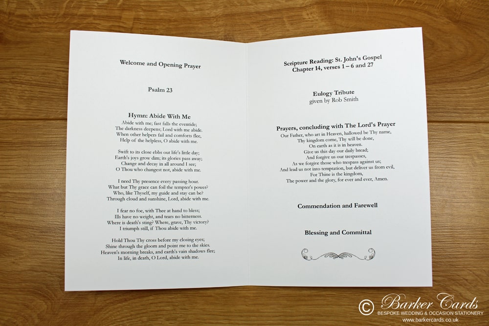
The inside pages of a funeral order of service are the most important part of the order of service booklet. This is where the running order of the funeral service will be printed. The actual content is usually supplied by a Vicar or Funeral Celebrant who is conducting the service.
When producing the layout for the service careful consideration should be given to how it will be used, many people like to use a semi-transparent image behind the text, although this looks visually pleasing in terms of design consideration needs to be given to the readability.
If the text is not easy to read people attending the service will not be as willing to join in when needed. As a rule we avoid adding in anything that isn't needed the text needs to be a suitable size for all to read and headings should be larger and properly spaced to aid readability during the service. Headings should be a slightly larger font size and be bolder than the rest of the text to stand out.
In some cases as every funeral service is different you can sometimes end up with extra space that needs filling to make everything look balanced. In these cases you have a few options available, it sometimes works to put the whole service on one side of the order of service and then have a hymn on the other side this can help to space things out.
Another way is to add in a picture, we have used this option on many occasions and it can help to not only fill out a short order of service but also makes it a lot more personal.
Remember, design elements that look visually pleasing should ideally be kept to the front and rear covers as these will be seen the most. The inside pages should be kept as easy to read as possible and as a final note, when it comes to text, bigger is always better as it's easier for all to read.